
Three charts to explain why most people are getting poorerBy Michael Burke
Most people in Britain are getting poorer. For obvious reasons, the government and supporters of austerity would prefer not to discuss this fact.
Yet in the strained language of the Labour right, there has also been a clamour for Ed Miliband to ‘change the narrative’ on the economy by no longer talking about the cost of living crisis. This is based on the completely false notion that that the economic recovery under way will inevitably produce higher living standards. This fails to understand the content and purpose of current economic policy. It is also based on a refusal to face facts.
Some of the key facts on the cost of living crisis are glaringly obvious. The chart below shows the change in regular average pay as well as the change in total pay including bonuses. Also included is the change in consumer price inflation.
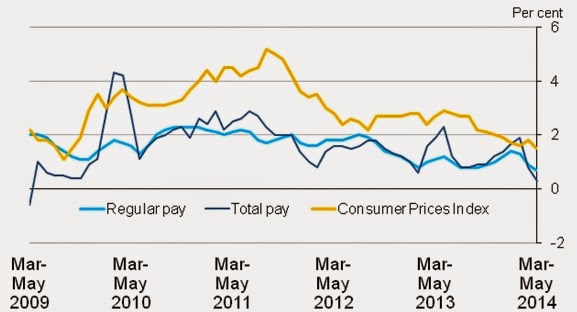
Under four years of the Tory-led Coalition, regular pay has fallen by 5.25%. This real decline in pay is understated in two ways. The first is that the CPI is a narrow measure of prices. In particular it excludes housing costs. Broader measures of inflation have tended to be higher over the last four years. In addition, only the pay of employees is captured by these average wage data. Anyone forced to work in self-employment, casual or other work without a regualr wage is not included in the data. These categories, along with part-time workers, have formed the bulk of the jobs growth over the last period, which has been a key factor in depressing wages generally. A broader, more accuarate picture of average wages would show a picture that is much worse.
It also seems as if the fall in living standards on this measure is unprecedented. The chart below is via Ed Conway, economics editor of Sky TV, who regularly provides very useful economic data. It shows the cumulative fall in real wages over a 5-year period.
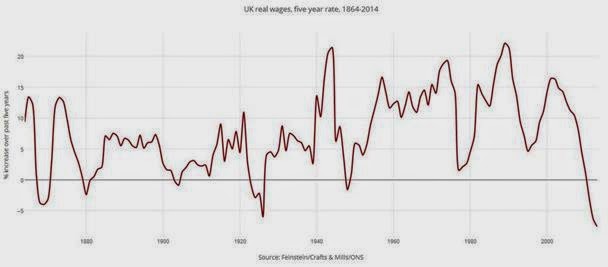
This shows real wages contracting by 7.6% over that time period. Real wages have not fallen so sharply since records began in 1864, not even in the Great Depression of the 1930s. As we have already seen, there is also no end in sight. Wages continue to fall behind inflation.
This is the key fact which underpins the ongoing cost of living crisis. But it is not confined to the issue of wages. Of a total British population of 64 million on latest estimates, only 30.6 million are in work. The rest, the majority of the population, are mainly comprised of young people, the elderly, the unemployed and economically inactive. They too have tended to experience a fall in living standards as social security entitlements and public services have been cut. They are often at the sharpest end of the cost of living crisis.
Austerity At Work
An obvious question arises, if the economy is recovering in real terms how is it that real wages have fallen so sharply? The answer is twofold. First, the population is growing, so that GDP per capita remains significantly below its 2008 level, before the recession.
But the content of austerity is to transfer incomes from labour and the poor (such as wages, or the benefits of social security as well as public spending) to capital and the rich (in the form of profits, tax breaks, tax cuts, privatisations, and so on). The aim is not to lead to stagnation, which is a consequence of the investment strike by firms. The aim of austerity policy is to boost the returns to capital. Under conditions of stagnation, this can only be achieved by reducing wages and the transfer payments to workers and the poor.
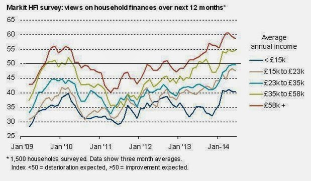
This can be seen directly even in the form of incomes and prosperity. The chart below is via Chris Williamson, chief economic at economic survey and analysis firm Markit. It shows expectations of household finances over the next 12 months by income bracket. In effect, the higher income households tend to be more optimistic on average about their living standards, while the poorer are more pessimistic. The poor are getting poorer. Among the rich, the lion’s share of the recovery is claimed by the ultra-wealthy, the owners of capital, landlords and so on.
The Tory Party sees no reason to change these trends of the economic policy that led to them. They would carry out more of the same, renewing the austerity offensive that has been soft-pedalled ever since the poll ratings plummeted in 2012.
Labour is currently debating economic policy. Evidently, it would be wholly counterproductive to abandon the focus on the cost of living crisis now, which is already the deepest on record and is continuing. Yet the scale of this crisis also means that any policy is appropriate to the magnitude of the crisis. SEB has previously outlined some of the measures that could be taken. All proposals and policies need to be assessed in light of the extremely grave economic crisis that Labour will inherit in 2015.

Recent Comments